Creating a three color T-shirt design with Paintbrushes and 3D effects in Adobe Illustrator
by Ger Peters
1. Project introduction
In this tutorial, I will be showing you how I use the Paintbrush Tool and the 3D Effects in Adobe Illustrator to create a simple piece of three-color T-shirt artwork. I use the brush tool to 'ink' my pencil sketch and the 3D effect to create somewhat convincing flying flags with logos.
I can't help but feel that, while a lot of people use Illustrator, both the brushes and 3D effects are widely neglected by most: It seems as if most users never 'grab' beyond their trusted pen tool... But both features, especially the brushes, provide great opportunities to come up with vector artwork with a bit more of hand-drawn flair to it as opposed to your typical 'penned' vector piece.
I'm using an actual project for Firebird Raceway of Boise, Idaho to base the tutorial on. As I've been doing artwork for this particular client for several years now and know them quite well, I can pretty much predict the course of the project and the way they will use the artwork.
2. Project briefing
The client was looking for T-shirt artwork for their annual "Oldies But Goodies Drags" nostalgia race event. The shirts would be freebie giveaways to the participants in the race: For budgetary reasons, the number of colors to be used was limited to three.
They supplied a photograph of the style of car they had in mind for this year's design; It was Jim Lytle's famous "Big Al" '34 Ford Tudor race car of the early 1960's. The picture showed the car with the heavily chopped fiberglass "flopper" body that Big Al became famous for. The driver's position was actually in the back seat as there was a 6-foot-long Allison V-12 P-38 aircraft engine stuffed into the car - hence the name "Big Al". The client suggested that I'd draw the car with a little less chop than in the picture and at the moment of launch, lifting the front wheels off the ground. They also supplied a couple of sponsor logos to include into the design with the stipulation of trying to make the addition of the logos look not too much like an "afterthought"...
There just so happened to be a story on Big Al in the November 2009 issue of Hot Rod Deluxe Magazine. It featured a tiny vintage photograph by an unknown photographer of Big Al racing at Lions Drag Strip in 1963. It showed the car in an early guise, back when it still had a steel body instead of the flopper body and with less of a chopped roof. Even though the car had all four wheels on the track, I thought it would still make for a good reference photo for my drawing. The client seemed to prefer a more or less realistic style for the drawing so I decided to do a pretty accurate representation of the photograph, but alter it a bit with a wheel-stand and a driver and some other changes of my own.
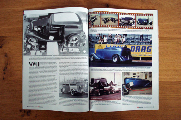 image 2_01 - story on Jim Lytle's "Big Al" in the November 2009 issue of Hot Rod Deluxe Magazine -
3. Sketchpad
To integrate the sponsor logos into the design, I came up with the idea of adding flags for the background: Besides providing a 'natural' space to put the logos, the flagpoles would have the additional benefit of granting the design some extra 'body' since the car by itself was pretty low. The challenge would be to have the sponsor logos arch along the curves of the flying flags in a nice way.
I repeated some design elements from the shirt designs that I had done for previous Oldies Drags events and did a quick sketch for the overall outline of the piece; just a small thumbnail really to capture the basic idea:
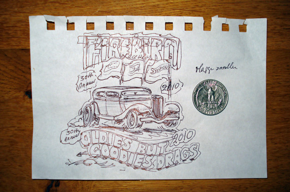 image 3_01 - quick thumbnail sketch -
Now I needed a larger, more refined sketch to present the idea to the client. So I started a more detailed outline as a rough draft and I e-mailed that to the client: They thought it looked good so far and gave me the green light to carry on. The rough draft will double as a template for my final artwork.
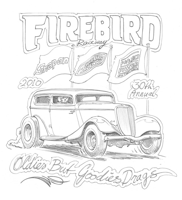 image 3_02 - rough draft as presented to client -
4. Illustrator brush basics
Note 1: This section applies to the 'traditional' Illustrator Paintbrush tool -not the so-called "Blob Brush" that was added to the newer Illustrator versions recently.
Note 2: To use the Illustrator paintbrush tool to the full extend, you need a graphic tablet (Wacom). The mouse is much less suitable as it is not pressure sensitive.
The Illustrator Brush Tool is widely neglected but it is really a very versatile and powerful tool. Here is a look at the Illustrator toolbox containing the paintbrush tool and my (customized) brushes palette:
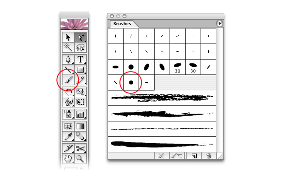 image 4_01 - paintbrush tool and brushes palette -
To create brushstrokes in Adobe Illustrator, you simply select the paintbrush tool from the toolbox, select the desired brush type from the brushes palette and use the stylus to paint strokes on your graphic tablet. Illustrator will calculate an underlying vector path for the stroke with anchor points (Bézier points) in strategic spots as well as record the width information from the amount of pressure you apply while drawing your stroke. The brushstroke will be wider where you pressed hard and narrower where you let off.
Paintbrush work in Adobe Illustrator is extremely rewarding and forgiving since every single stroke you draw is a 'live' vector path that can be individually addressed and thus remains fully editable.
To edit the appearance of a brushstroke, make sure it is active (selected) and either:
- Retouch your stroke using the brush tool or pencil tool to change the curvature;
- Use the scissors tool to cut your stroke into smaller bits;
- Use the eraser tool to remove part(s) of your stroke;
- Adjust the width of your entire stroke by changing the numeric value;
- Change the appearance of your stroke by selecting a different brush type from the palette;
- Change the angle and other attributes of your brushstroke by editing the brush type presets;
- Adjust your stroke by pulling the Bézier handles on individual anchor points of the vector path;
- Scale, rotate, skew or free-transform your stroke into the desired shape.
Find some illustrations of these stroke-editing options below.
Should all of these options still fail to produce the perfect brushstroke for you, simply delete the entire stroke and paint a new one without disturbing any of the underlying artwork.
I do 95% of my ink-work with only one single brush. It is just a simple round brush with an 8 pt diameter. Double clicking its icon in the brushes palette produces the dialogue box for the brush-options or -presets.
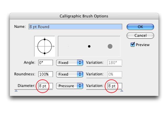 image 4_02 - brush-options for my main brush -
Note that I have selected "pressure" in the stroke width field to accommodate for the pressure sensitivity of the graphic tablet. Also note that the width variation is relatively large at 8 pt, so 100% of the actual brush size.
With these options, you'll be able to nicely control the width of your brushstrokes for doing digital ink-work or pinstriping on your graphic tablet.
In the example below, you see some sample brushstrokes with the above settings. I left the underlying vector paths selected so you can see what is going on underneath the outer appearance of the strokes.
A - Brushstroke drawn while applying little pressure;
B - Brushstroke drawn while applying more pressure;
C - Brushstroke drawn while applying increasing pressure from left to right;
D - Brushstroke C partly deleted (cut) using the Scissors tool;
E - Brushstroke C partly deleted (erased) using the Eraser tool.
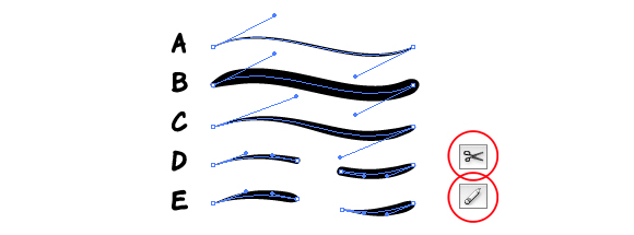 image 4_03 - sample vector paths - brushstrokes -
To adjust the stroke width of an entire stroke, simply select the stroke and change the numerical value for the stroke width in the stroke-weight dialogue box.
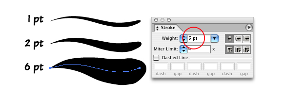 image 4_04 - editing the stroke width value of a brushstroke -
In order to change the appearance of the brushstroke by applying a different brush type, make sure the stroke is selected and simply pick another brush type from the brushes palette. In the example below, different brush types are applied to duplicates of a stroke. Note that some brush types support the variable width from left to right while others do not.
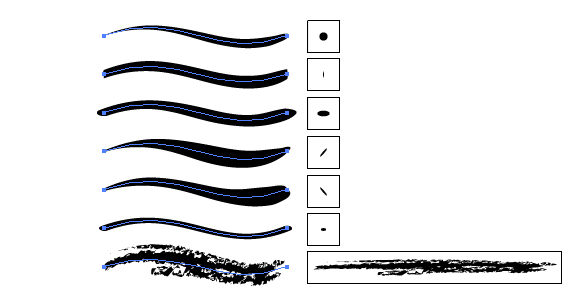 image 4_05 - applying different brush types to a stroke -
To manipulate the curvature of a brushstroke, simply try retouching it with the brush tool or pencil tool. This is an extremely powerful option:
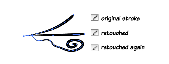 image 4_06 - stroke manipulation by retouching -
You can also manipulate or "steer" your stroke by adjusting the vector path by moving, deleting or adding anchor points and pulling Bézier handles like with any other shape you draw in Illustrator. In this way, a straight stroke can even be 'massaged' into a circular stroke, should you so wish; see image below. Again, I have left the vector paths and handles selected to give an idea of what is going on underneath the outer appearance of the strokes. Note that I have added an extra anchor point in the last step.
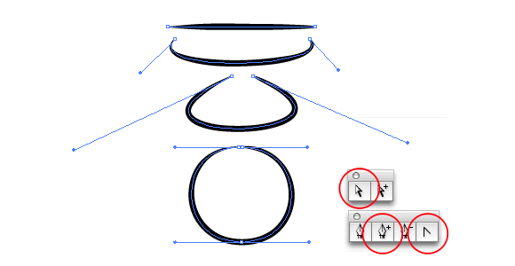 image 4_07 - vector path manipulation -
As with all vector objects, brushstrokes can be scaled, rotated, skewed or free-transformed. Note that there is a difference between A - scaling a brushstroke and include scaling the stroke-weight and B - scaling a brushstroke and exclude scaling the stroke-weight:
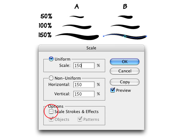 image 4_08 - scaling brushstrokes -
You'd almost say that the perfect ink-job is within anyone's reach with so many options at your disposal to manipulate and retouch your brushstrokes, right? Illustrator brushwork indeed gives you unlimited opportunities to transform and experiment and do some trial and error.
There is a bit of a learning curve involved however: Brush behavior may seem erratic and awkward at first. But with a little practice you will pretty soon start to get the 'hang' of it. In time, you'll really start to appreciate the Illustrator brushes: They allow you to work in a much more loose and freehand style than what you're used to if you have done mostly pen-tool work. Should you rather rely on the trusty pen tool to draw your strokes or if you use a mouse instead of a graphic tablet, you can still assign brushstrokes to your paths but you do not have the additional feature of the variation in line widths. After all; mouse clicks are all recorded at an even 'pressure'.
5. Inking the car
Now; with the above brush basics under our belts, we're finally ready to move on to doing some actual work: I start a new Illustrator document, place my sketch on a template layer, load my brush and start inking. Here is a step-by-step animation of inking the car:
 image 5_01 - animation of the ink-work for the car - (animated GIF-file)
Looks easy enough doesn't it? Most strokes are drawn freehand and adjusted after that if necessary. For the wheels, I use a combination of freehand strokes and ellipses with brushstrokes assigned to them. The ground shadow is a combination of two different brush-types, one an irregular one of the so-called "art-brush" variety. For the grille, I have also used an irregular art-brush and entered a very low numerical value for the stroke weight. The driver was copied and adapted from an old project to save a bit of time... I guess this guy gets around... Remember he sits way back because of the V-12 engine...
Note how I left the drawing some 'breathing space' by not completely closing paths in some specific areas: Leaving some strokes open is very important to prevent a drawing like this from getting too 'confined' within its own lines. You have to "Let it breathe like wine." To quote art teacher and illustrator Andrew Loomis from his book Creative Illustration: "There is a 'lost and found' of edges as they truly appear in space."
The pink strokes will be lighter highlight spots in the final drawing. Some of these are used to 'loose' the edges, again to give the drawing a bit of air... The pink color is just to set the strokes off from the white of the working space. I include them in the line art to make sure they will stay in their place (on top) after some color fills are added at a later stage.
Here's a look at some of the vector paths so far: Remember that Illustrator generates the anchor points while you're drawing. I did get rid of a lot of unwanted points though and repositioned other points to more strategic positions in order to "steer" my strokes exactly in the direction I wanted them to go.
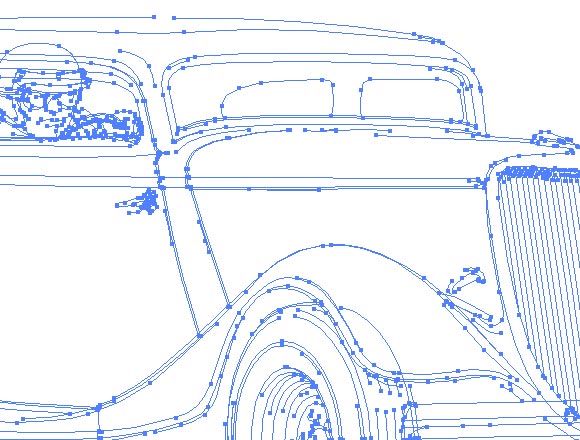 image 5_02 - underlying vector paths so far -
And some close up views of the completed line art:
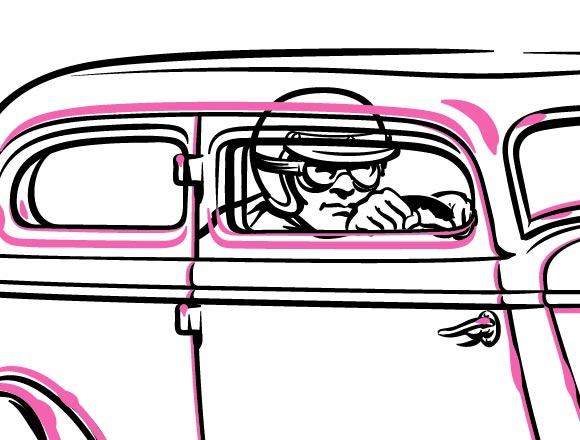 image 5_03 - line art detail 1 -
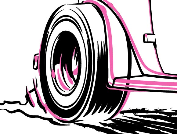 image 5_04 - line art detail 2 -
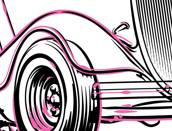 image 5_05 - line art detail 3 -
Note that, even while I'm calling my line art "done" at this point, this is just a status quo for now: I will most likely be adding more details and changing a thing or two when I zoom in on specific areas of the drawing in the next step when I'll be adding some color.
6. Colorizing the car
Since Big Al had blue paint, that color seemed only natural to use as my main color for the drawing. The design will be screen printed on white shirts and since I'm limited to a color palette of four (including the white of the shirts), I opted for blue, grey and black as the additional print colors. I found that grey is a nice "support" color for any other color when you're doing this kind of car-art. I picked a PMS blue and a PMS grey from the Pantone Color Guide to work with: Of course, I can always change my colors at a later stage of the project.
I continue to work on the line art by defining some temporary 'hard edges' for my color areas. I draw them in as blue brushstrokes now. To come up with these borders, think about how the light could reflect off the surfaces of the car but stylize and simplify it a bit; we're not striving for photo-realism in a three-color project after all.
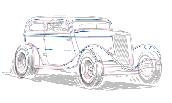 image 6_01 - borders for the color fills -
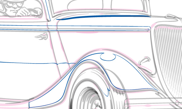 image 6_02 - borders detail -
Now let's bring Big Al to life by adding some color!
To create a color shape in Illustrator, you need a closed path. I use my brushstrokes to build accurate closed paths:
Step 1: Select all strokes that define the edge of the shape you want to fill.
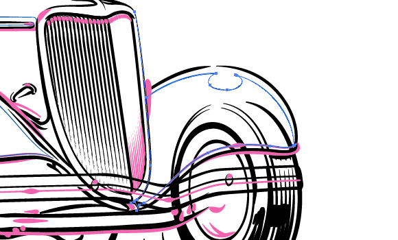 image 6_03 - building a color shape step 1 -
Step 2: Copy and Paste to an empty space or layer on your working-space.
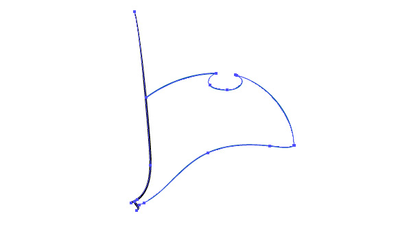 image 6_04 - building a color shape step 2 -
Step 3: Remove the brushstrokes from the paths by clicking the "Remove Brush Stroke"-button in your brushes palette; Your strokes have become 'ordinary' lines now.
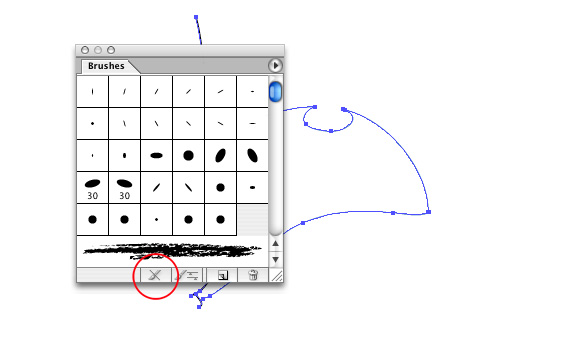 image 6_05 - building a color shape step 3 -
Step 4: Trim the paths with the eraser and/or scissors tools.
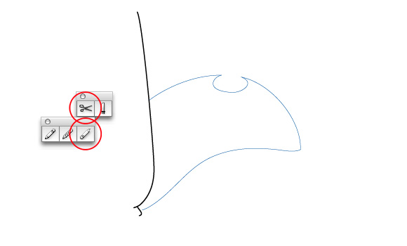 image 6_06 - building a color shape step 4 -
Step 5: Connect (Join) all adjacent endpoints to 'weld' a single closed path.
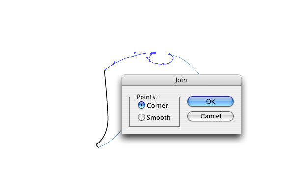 image 6_07 - building a color shape step 5 -
Step 6: After the path is closed, select a fill color - in this case a gradient from 0% spot blue to 100% spot blue - and remove the stroke itself by setting the stroke of the path to "None".
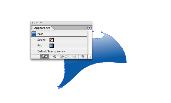 image 6_08 - building a color shape step 6 -
Step 7: Move the color shape into position and Cut and Paste behind - or in this case in between - your line art.
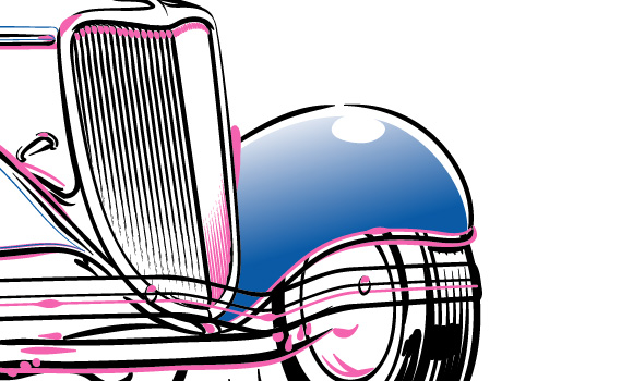 image 6_09 - building a color shape step 7 -
Repeat this procedure for all the fills that you need.
Unfortunately, there's no way to automate this process. An alternative would be to draw closed paths with either Pencil tool or Pen tool but the resulting shapes are less accurate and can sometimes cause unwanted gaps between the fills and the brushstrokes if you do any scaling or other transformations later.
Here's a look at the car after I added all my color fills: I'd say the car is complete at this point...
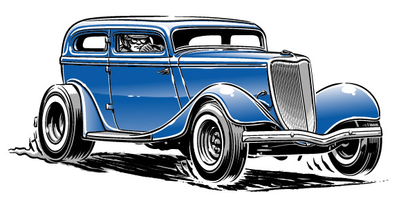 image 6_10 - completed car -
Here's a look at just the 'naked' color fills with the line art removed:
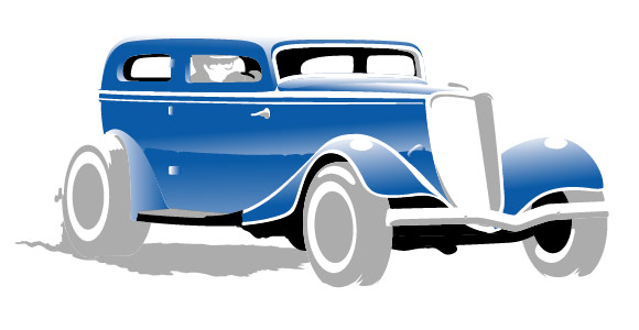 image 6_11 - color fills only -
And here's a look at the completed car in black and white:
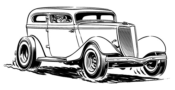 image 6_12 - completed car in black/white -
Note that I've been adding to my line art here and there while I have been working on the colors: At some point I decided that the car didn't look good without a rear window (even when there's no rear window visible in the reference photo) - so I added one. I also hinted at something of a roll cage around the driver and some other small details; anything really to make the drawing look more convincing. Don't adhere to your reference material too rigidly, be creative!
On a whim, I tried a different color - purple instead of blue...; yeah much catchier, don't you agree? Let's work with this for a while, see if it will 'stick'.
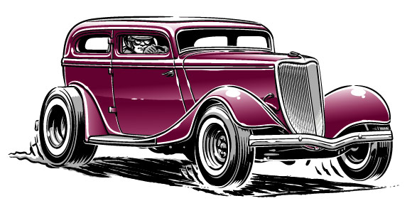 image 6_13 - color change -
7. Creating the flags
Time now to concentrate on the flags. I started by drawing some simple outlines with brushstrokes. The flags are all drawn slightly different but essentially along the same curves to ensure a uniform look.
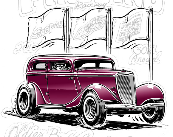 image 7_01 - flags line-art -
Remember that the purpose of the flags is to accommodate the sponsor logos - I do not want to 'mangle' the logos too much. That means that the flags can only be mildly curved in this project. Here's the first logo I will be using; It is a vectorized version of Firebird Raceway's own vintage logo from the 1960's.
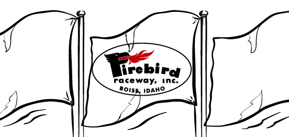 image 7_02 - vectorized logo -
For these mild curves, I could probably try warping the logo into shape with the obvious candidates and get away with it: Warp Effects and the Envelope Distort Option... but that would mean boring uniform curves and no 'real' perspective... Besides, I want to show you how to use a more advanced and exiting Illustrator feature here, one that would work just as well for heavily curved surfaces: 3D mapping!
With 3D mapping, you first build a very basic 3D object and then project (map) your artwork onto one or more surfaces of that object. The projected artwork follows the curvature of the object perfectly. For example; a label on a beer bottle or a sticker on a crash helmet. Things like that are often pretty hard to draw accurately so why not call 3D to the rescue!
I'm using Illustrator CS with the integrated 3D functionality. For those using older versions of Illustrator, the Adobe Dimensions application can be implemented for the 3D effects. Here's how I mapped the logos for the flags:
Step 1 - Any artwork you'd like to map in Illustrator should first be made into a so-called "Symbol":
Simply select the artwork (the logo) and click "New Symbol" in the fly-out menu of the Symbols palette. Enter a name for your new symbol in the name field. After creating the symbol, you no longer need the actual logo, so you might as well delete that from your document now to free up some space.
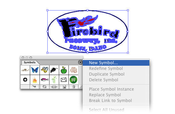 image 7_03 - creating a Symbol -
Step 2 - Figure out how to best create the basic 3D shape you need. The idea is to draw a ground-form in Illustrator and use the 3D functionality to either Extrude, Revolve or Rotate that form into your 3D object. Now let's see... if I had a contour - a top view of the flag - I could use Extrude to 'stretch' it into a simple 3D flag...
So I draw a curved path representing the top contour of the flag as seen from above. I make it a very light shade of grey to get a bit of a 'whitish' flag after the extrude procedure.
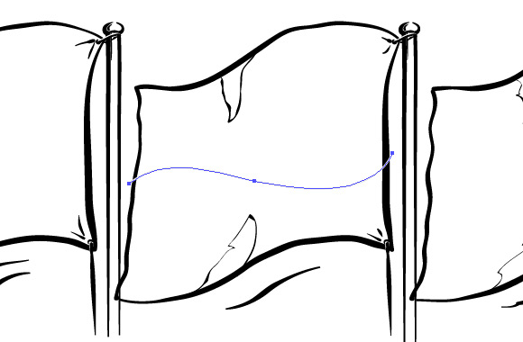 image 7_04 - flag contour as seen from above -
Step 3 - Now select your contour and go to Effect - 3D - Extrude & Bevel to bring on the 3D Extrude dialogue box:
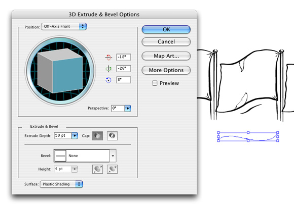 image 7_05 - 3D Extrude dialogue box -
Step 4 - Check the "Preview" box to see what you're doing: Enter a value for Extrusion Depth (the height of the flag), in this case 150 points looked OK. Dragging your cursor over the 3D cube in the dialogue box allows you to real-time rotate your 3D object around three axis. You can also adjust the degree of perspective distortion to make the object match your needs better.
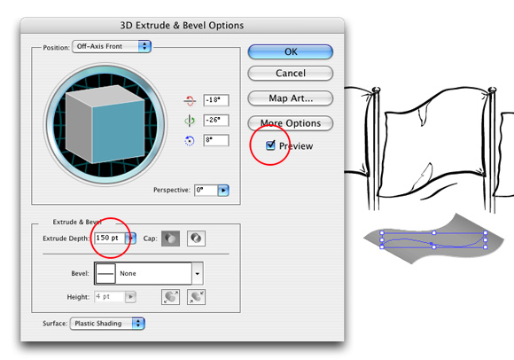 image 7-06 - extruding the contour -
Step 5 - What we have essentially created here is a curved box with 6 surfaces; top, bottom, left side, right side, front and back. Here is a close-up view in wire-frame mode:
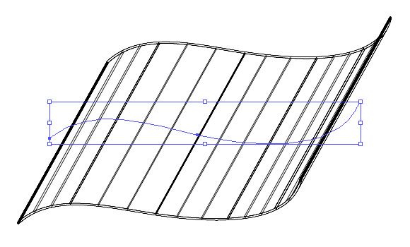 image 7_07 - 3D wire-frame -
Step 6 - To map artwork onto a surface, click "Map Art" in the 3D Effects dialogue box. Select the desired surface by clicking through the arrow buttons and select your newly created symbol (the logo) from the pull-down list. Make sure the "Preview" box is checked to see the effect of your selections.
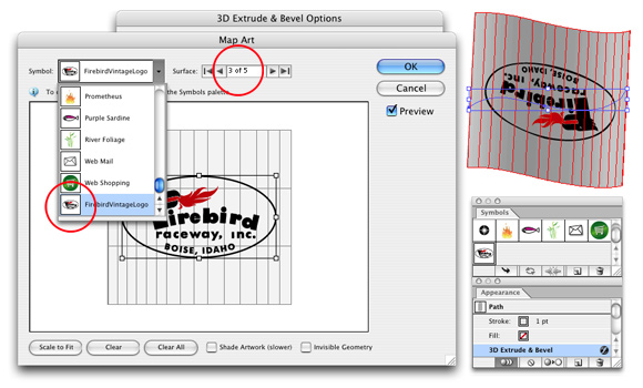 image 7_08 - mapping artwork -
Step 7 - Now adjust the position and the scale of the mapped symbol on the grid representation of your selected surface. In my case the symbol was upside down so I rotated it by 180 degrees. I also scaled it up slightly by pulling the handles.
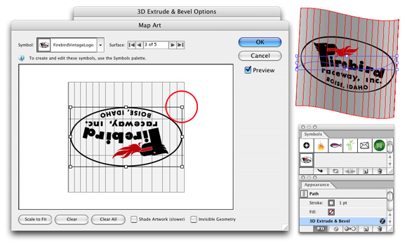 image 7_09 - adjusting the position and scale of mapped artwork -
Step 8 - For as long as the 3D effect is "live" (not flattened), you can adjust your settings and the view by dragging your cursor over the cube; try it; it's fun! The idea is to rotate it into a position and perspective that more or less matches your sketch. You'll especially love this if you've never worked with 'real' 3D applications.
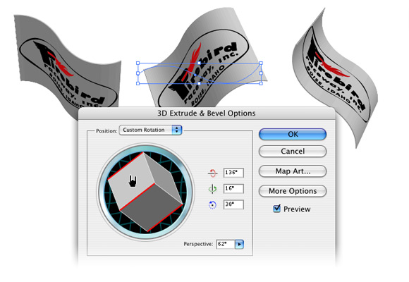 image 7_10 - real 3D! -
Step 9 - Hit the OK-button to close the 3D dialogue box after you're done. You can always re-open it by selecting your 3D object and double-clicking its Effects-symbol in the Appearance palette.
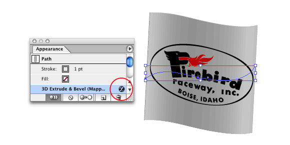 image 7_11 - the Appearance palette -
Step 10 - After I'm happy with my flag, I duplicate it twice and swap my logo symbols in the "Map Art" dialogue box (see Step 6) to create the remaining two warped logos.
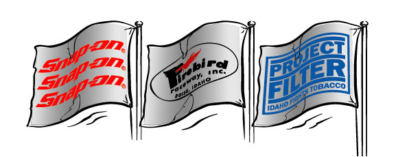 image 7_12 - all three logos -
Step 11 - For this drawing, the 3D object was solely created to obtain accurate curved vector logos, so I go to Object - Expand Appearance to "flatten" the live effect into flat vector art.
The flattening not only results in a permanently curved logo, but also in a large amount of colored objects that together form a representation of the shading of the flag. If you're doing full color artwork that has to look real, I suggest you get rid of these and recreate the flag in simpler vector objects with gradients or even a color mesh. Placing your logo on top of that and then setting its transparency mode to "Multiply" produces a very convincing look. In this case, I don't want accurate shading, but rather a more stylized look.
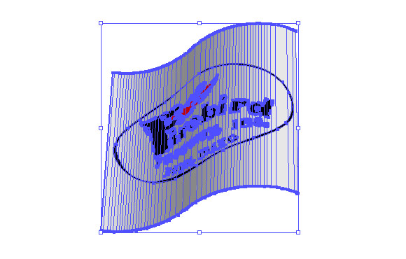 image 7_13 - flattened 3D object -
Step 12 - You sometimes need to manually correct some small artifacts in mapped artwork. In this case the oval outline was deformed and too narrow in a couple of spots:
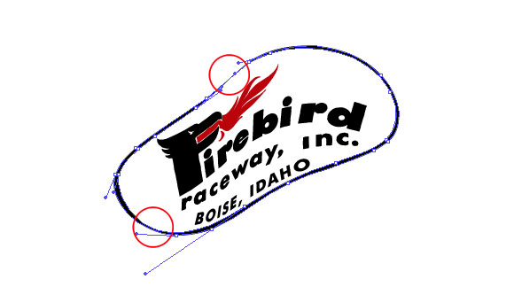 image 7_14 - correct artifacts -
And here are the three completed flags: The logos really require the use of red I think so I'm switching colors once again for my entire piece.
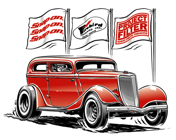 image 7_15 - the completed flags -
Remember I only wanted mild curves for this project but the 3D method will also work for wilder shapes. After you start using the Illustrator 3D Effects, you will automatically come up with ideas of how to use them to help you with your vector work. I have used 3D effects in my drawings to map lettering onto hubcaps, thread patterns onto tires, logos onto helmets and even to generate an accurate template to draw a coin dispenser.
8. Finishing the project
Now let's add the lettering. I don't think I will have to elaborate much on that; just your typical vector work with multiple outlines. Suffice it to say that a warp effect was applied and that the 'Type on a Path' tool was used as well.
To add to the nostalgic theme of the piece, load up your brushes one more time and lay down a bit of "old school" pinstriping here and there... use the same brush that was used for the ink-work... don't worry if you're no Von Dutch; you can always wipe the stripes off as long as the paint is still wet... hahaha.
Then add some finishing touches. It's pretty straightforward really; Look for dull spots or other problem areas and try to come up with a nice solution within the parameters of the project: Remember the number of colors was restricted to only three; you can cheat a little by creating different graduations of a spot color with halftones. Simply adjust the percentage slider of the spot color to create your halftone. Oh and don't forget to add your signature after you're done!
And here's the final piece ready to be sent to the client for approval. I presented them with three color options -red, dark blue and purple- to let them have something to choose from. It only takes a minute to change colors for the entire piece so it's really no trouble at all. I'm betting the client will go for the blue version after all...
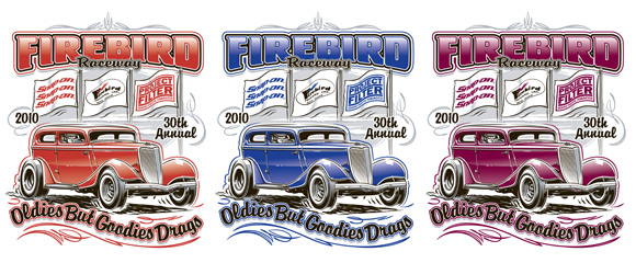 image 8_01 - color options -
After a while, I received feedback from the client; they thought the artwork looked "outstanding". They approved of the piece without asking for any changes: Hurray! And just like I thought they would; they went for the blue version. So here is the final T-shirt artwork:
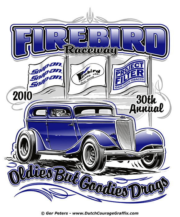 image 8_02 - final T-shirt artwork -
9. Conclusion
I am also pretty happy with the way the drawing turned out; not too shabby for a freebie shirt with sponsor names. Thank you guys for reading and maybe some of you picked up a trick or two... If you're already an Illustrator user, I hope to have persuaded you to at least look into the Paintbrush Tool and to maybe have a look at the 3D feature as well. Both can help you create "outstanding" vector art. If you're not an Illustrator user (yet), I hope to at least have given you some insight into how you could use this superb drawing tool to your advantage. Maybe you will try it some time and maybe you will find out that you are a 'vector-guy' after all. Anyway; some of you might have heard that old saying: "Give a chimp a typewriter and he will eventually write Shakespeare"... Don't forget that it takes a lifetime of drawing experience to develop a good understanding of what it takes to make a piece of artwork look good... computer or not. Study how the old masters drew their stuff without an Undo-key... Here at the Motorburg community, we're standing on the shoulders of Giants - quite literally... Watch and learn... I am still learning every single day. Computer drawing applications cannot compensate for poor craftsmanship...
A big thumbs-up to the 'Giants' at Motorburg for inviting me to contribute some 'real' Content! I feel both humble and privileged at the same time. Wow!
Ger Peters
www.DutchCourageGraffix.com